Green Ice Camera
Non-Governmental Organisation (NGO)
rebranding, strategy, web-design structure

The story
Green Ice Camera (GCA) is a nonprofit organization that aims to make media production in the Arctic and Barents region more sustainable and community-focused. By providing resources and guidance, GCA encourages media producers to adopt eco-friendly practices that respect the environment and local communities.
GCA is on a mission to spread the word about sustainable media production practices beyond the Norwegian and Barents Region's Arctic. The organization hopes to make an impact also in Iceland, Canada, Greenland, and Alaska's Arctic, empowering media producers to take social responsibility seriously.
Needs of the organisation
![]() Attract the interest of producers in the Arctic and promote the adoption of Green Ice Camera (GIC) work procedures in their productions.
Attract the interest of producers in the Arctic and promote the adoption of Green Ice Camera (GIC) work procedures in their productions.
Fulfilment
![]() rebranding, communicating professionalism and experience
rebranding, communicating professionalism and experience
![]() strategy to support GIC ambitions
strategy to support GIC ambitions
![]() structure for their web design to guide users through specified stages (marketing funnel) to the desired actions
structure for their web design to guide users through specified stages (marketing funnel) to the desired actions
Communication designed
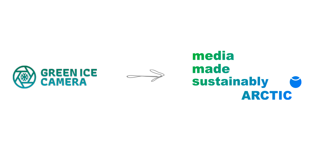
GIC underwent a rebranding to convey professionalism and expertise, and avoid being seen as a project aimed solely at younger audiences.
The new brand also allows to keep the doors open and expand its reach to other forms of media produced in the Arctic, such as photography, music, and theatre, if needed in the future.
The rebranding also helps to avoid the risk of being labeled as "greenwashing," which can lead to skepticism and mistrust from consumers who are wary of green claims that lack substance. By removing the word "green" from their name, GIC is better positioned to establish a reputation for effective and credible sustainability practices, especially since they are not yet widely recognized globally for their long-term activities.


GIC aims to become a leading certification mark for sustainably produced media across the entire Arctic region. The new name and brand identity convey a clear message about the organization's mission and the way films are produced, helping to increase awareness and influence beyond GIC's current circles.
The ultimate goal is to inspire other media professionals to adopt sustainable work procedures and contribute to a more eco-friendly and socially responsible media industry in the Arctic.
By establishing itself as a trusted certification mark, GIC can promote greater accountability and encourage media producers to prioritize sustainability in their productions.

The Media Made Sustainably Arctic acronym, or "mms Arctic," has been designed specifically for use in limited spaces such as A6 flyers and stationery. The acronym is easy to remember thanks to its similarity to the well-known multimedia messaging service (MMS) acronym.
By using the mms Arctic logo, it will be easier for people to spread the word about the organization and increase traffic to their website. The simplified variation of the logo is optimized for smaller sizes, making it a versatile and effective branding tool for a wide range of promotional materials.

The blue circle represents Earth and the white semi-circle, the Arctic.

In addition to representing the Arctic Circle, the white semi-circle in the logo is also subtly suggestive of a smile. This element conveys a sense of positivity and hope, highlighting the organization's commitment to promoting sustainable and responsible media practices in the Arctic region.

The blue circle in the GIC logo, which represents planet Earth, is deliberately positioned in the same location as a registered trademark symbol, ®. This symbol typically denotes registration with a patent and trademark office, conveying a sense of legal protection.
By incorporating the suggestion of ® symbol into the logo, GIC communicates its commitment to protecting the Arctic region and promoting sustainable media practices in the area.
The logo creates a strong impression of security and reliability, underscoring the organization's dedication to safeguarding the fragile ecosystems and unique communities of the Arctic.


Brand Identity
![]() Name development
Name development![]() Logo
Logo![]() Colors
Colors![]() Fonts
Fonts![]() Imagery/photographs
Imagery/photographs![]() Tone of voice
Tone of voice![]() Keywords
Keywords![]() Tagline
Tagline![]() Brand positioning
Brand positioning![]() Strategy
Strategy
Applied on
![]() Business cards
Business cards![]() Letterheads
Letterheads![]() Email signatures
Email signatures![]() Reports
Reports![]() Posters
Posters![]() Brochures
Brochures![]() Banners
Banners![]() Social media
Social media![]() Campaigns
Campaigns![]() Websites
Websites
Website design
![]() Website development
Website development![]() Hosting for websites
Hosting for websites![]() Custom emails
Custom emails![]() Enhanced security
Enhanced security![]() Back ups
Back ups![]() Technical support
Technical support
![]() Enhanced performance and UX (User Experience)
Enhanced performance and UX (User Experience)
![]() WPO (Web Performance Optimisation)
WPO (Web Performance Optimisation)
![]() SEO (Search Engine Optimisation)
SEO (Search Engine Optimisation)
![]() CDN (Content Delivery Network) improving WPO and SEO
CDN (Content Delivery Network) improving WPO and SEO
![]() Low carbon emissions websites
Low carbon emissions websites
![]() Landing pages (campaigns) design
Landing pages (campaigns) design
![]() Analytics
Analytics
![]() WordPress CMS (Content Management System)
WordPress CMS (Content Management System)
Communication Design Studio (Palguta) is a registered sole proprietorship in Norway number 926 834 789


