Samples of websites by industry
Below, you'll discover a range of website examples across various industries, accompanied by helpful tips to consider as you embark on a website design project either solo or with a design professional.
Each example includes a subdomain link that showcases the website's look and feel. Please note that not all links on the subdomains are fully functional as they are solely for demonstration purposes.
List of contents
Business website examples
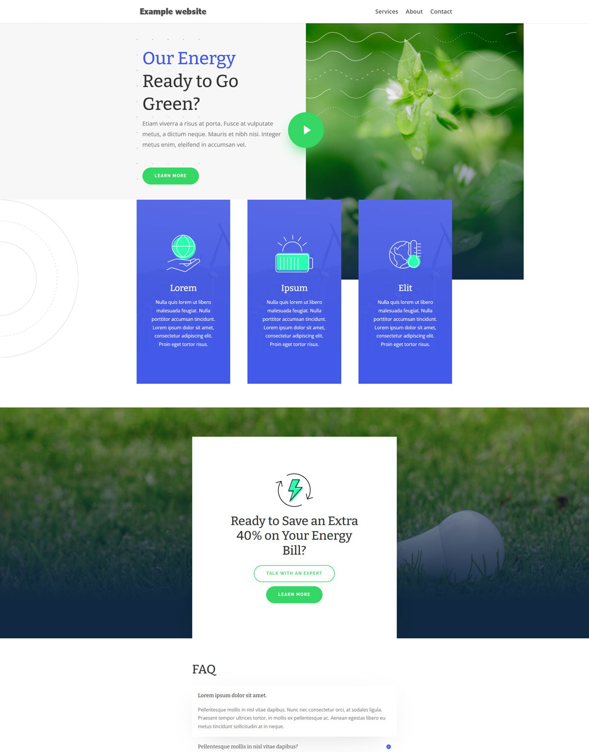
Green energy
Focus on the appropriate terminology and design.
When it comes to creating effective communication materials, focusing on the appropriate terminology and design is crucial. Using language that is clear, concise, and easy to understand can help ensure that your message is delivered accurately and efficiently.
Additionally, a well-designed layout can help grab the reader's attention and guide them through the information in a logical and visually appealing way. By prioritizing these elements in your communications, you can increase the impact and effectiveness of your message.
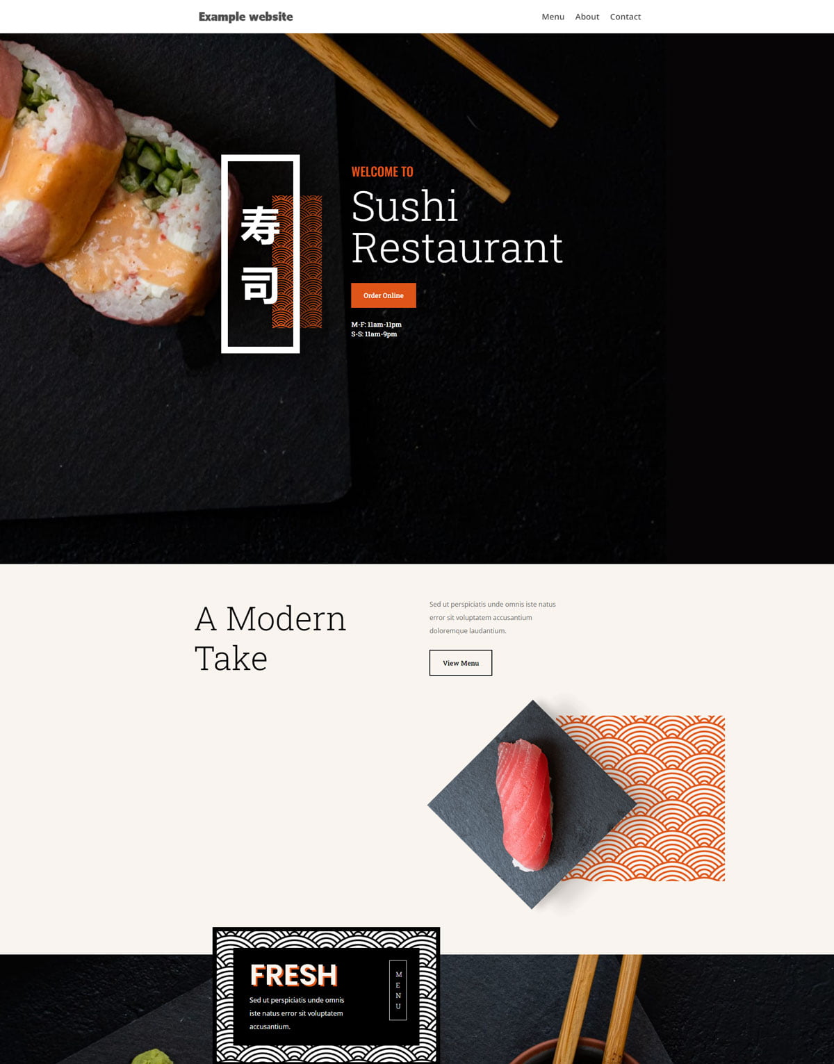
Restaurant
Use imagery that resonates with audiences searching for specific services/products.
Using imagery that resonates with your target audience is a powerful way to grab their attention and create a connection with them. When selecting images, think about the emotions and desires that your audience may have when for example searching for a sushi restaurant. You could use images of fresh, colorful sushi rolls that are beautifully presented.
This can help your audience envision themselves enjoying a delicious, high-quality meal at your restaurant. By using imagery that speaks to your audience's appetite and desire for high-quality cuisine, you can increase the chances of capturing their attention and driving them towards visiting your restaurant.
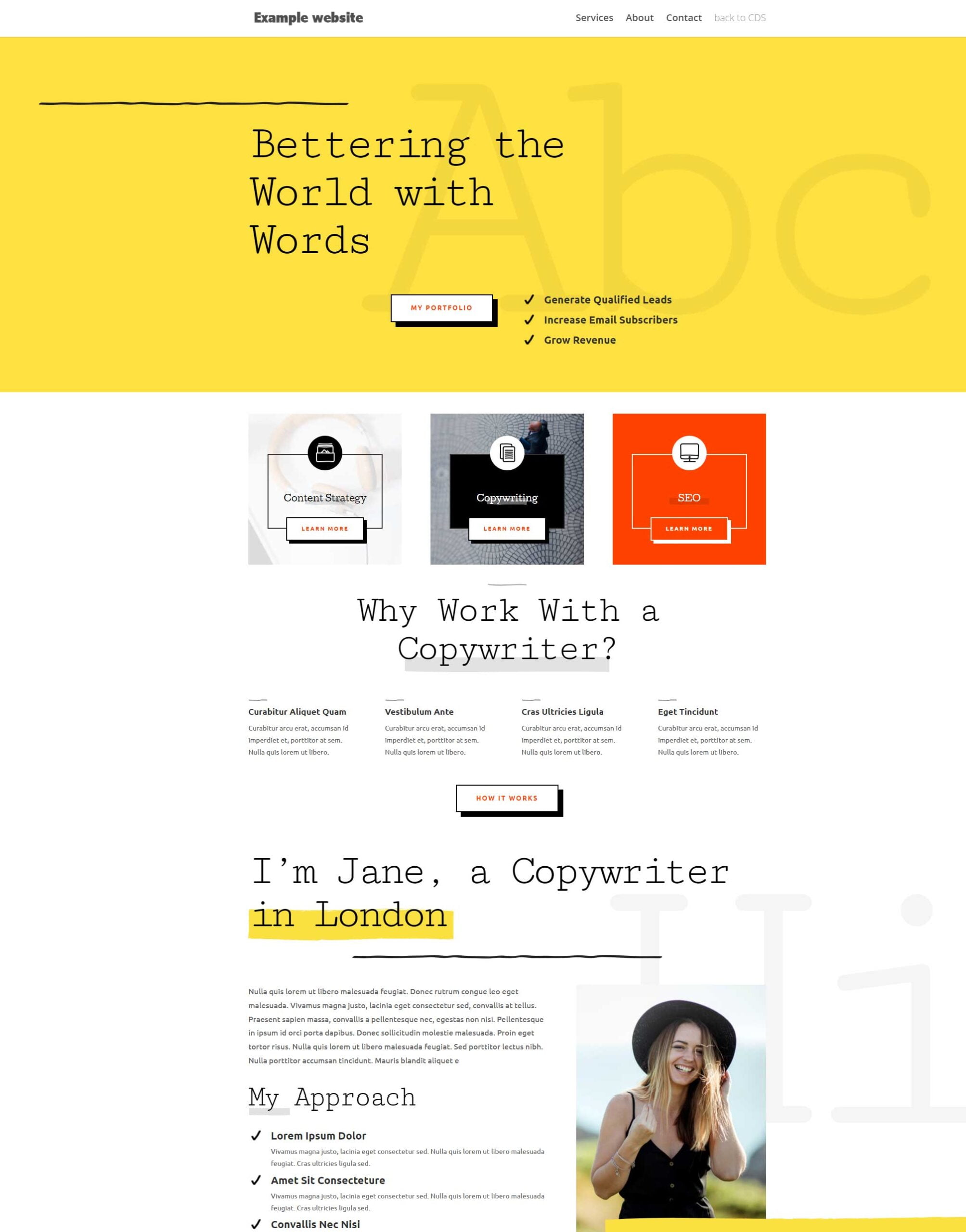
Freelance
Focus on your target audience.
When designing a website, it's essential to focus on your target audience to ensure your site is both visually appealing and effective.
By understanding your target audience's needs, preferences, and behavior, you can create a website that resonates with them and encourages them to take action.
Consider factors such as age, gender, location, interests, and goals when selecting color schemes, typography, images, and other design elements.
A website designed with the target audience in mind can help increase engagement, build trust, and ultimately drive conversions.
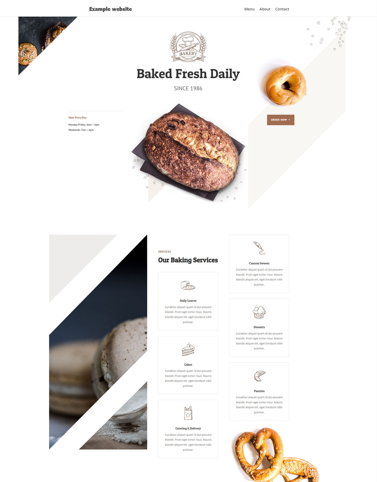
Bakery
Choose the main purpose of a website and draw the attention of its viewers to it.
The main purpose of a website can vary depending on the business or individual's goals, but it's important to clearly communicate the purpose to viewers to ensure they take the desired action.
For example, if the main purpose of the website is to sell products or services, it's important to draw viewers' attention to the sales pages or call-to-action buttons.
If the website's purpose is to build brand awareness, it's important to showcase the brand's values, mission, and unique selling proposition.
By designing the website with a clear purpose in mind and highlighting it throughout the site, you can increase the chances of viewers taking the desired action.
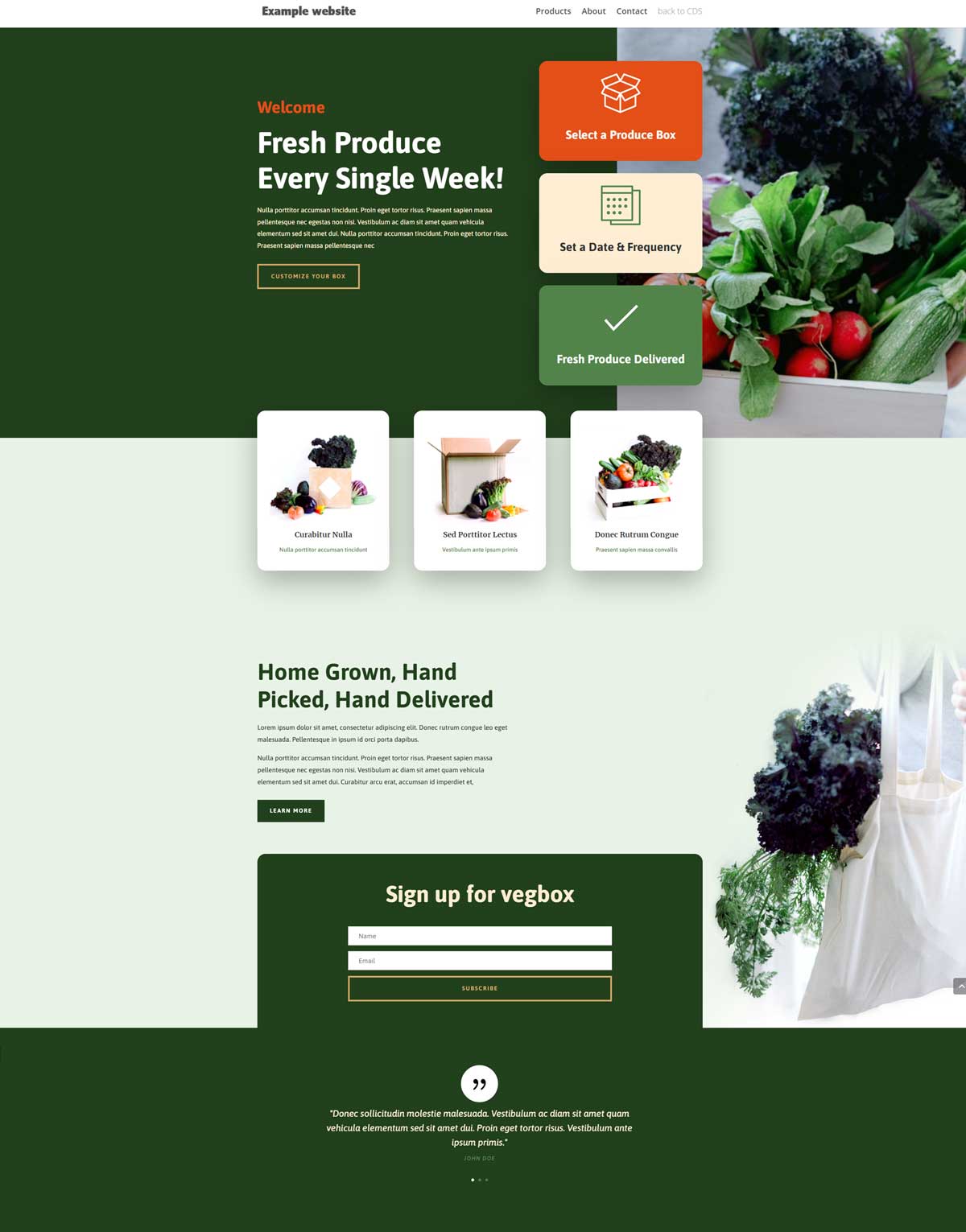
Vegbox
Make it easy.
Making it easy for website visitors to fulfill their needs is essential for a positive user experience.
To do this, you need to clearly communicate what visitors need to do and simplify the steps required to do so. Start by identifying the most common needs of your target audience, such as selecting produce box and setting a date and frequency.
Then, design the website with clear and concise calls to action, such as buttons or links, that guide visitors towards fulfilling their needs.
Additionally, simplifying the process by reducing the number of steps required can help make the process more efficient and increase the likelihood of conversions.
By prioritizing ease of use and simplifying the steps, you can create a website that meets the needs of your target audience and encourages them to take action.
Vegbox
Make it easy for visitors.
Making it easy for website visitors to fulfill their needs is essential for a positive user experience.
To do this, you need to clearly communicate what visitors need to do and simplify the steps required to do so. Start by identifying the most common needs of your target audience, such as selecting produce box and setting a date and frequency.
Then, design the website with clear and concise calls to action, such as buttons or links, that guide visitors towards fulfilling their needs.
Additionally, simplifying the process by reducing the number of steps required can help make the process more efficient and increase the likelihood of conversions.
By prioritizing ease of use and simplifying the steps, you can create a website that meets the needs of your target audience and encourages them to take action.
Education website example
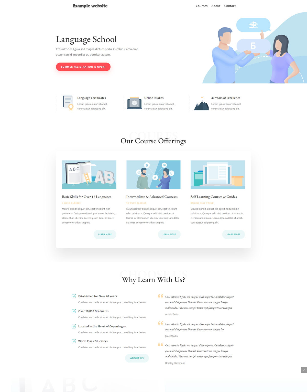
Language school
Welcome a white/negative space.
White or negative space is an important element of website design as it provides balance and visual appeal, while also helping to improve user experience.
By using white or negative space, you can create a clean and uncluttered look that highlights the most important elements of your website.This can include text, images, and calls to action.
White space can also make content easier to read and navigation more intuitive. However, it's important to strike a balance between using enough white or negative space and ensuring that the website doesn't appear empty or unfinished.
By incorporating white or negative space effectively, you can create a visually appealing and user-friendly website.
Not-for-profit website example
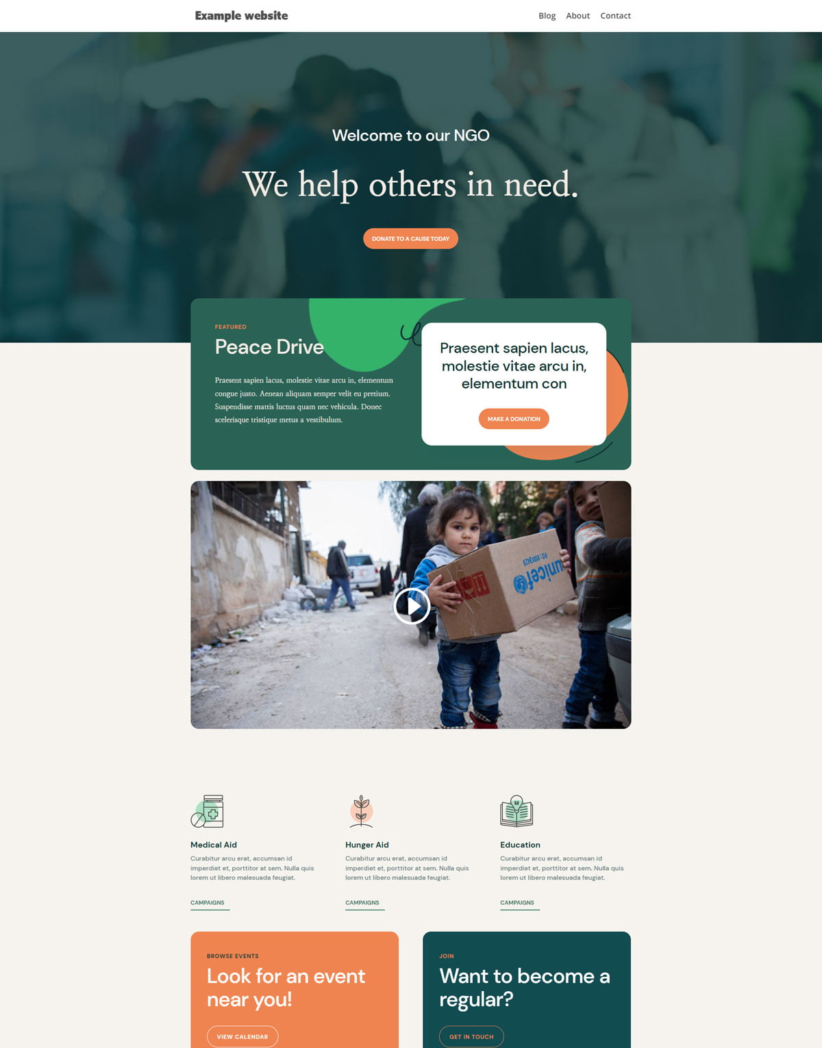
NGO
Present a video when appropriate and possible.
Incorporating video into a website can be an effective way to engage visitors and provide a more dynamic and interactive user experience. Videos can help explain complex topics, showcase products or services, and convey the personality and tone of the brand.
When using video on a website, it's important to consider the appropriate placement and context. For example, adding a video to a landing page can increase engagement and conversions, while including a video in a blog post can help illustrate a point or provide additional information.
Additionally, it's important to ensure that the video is of high quality and optimized for fast loading times to prevent buffering or delays.
By incorporating video appropriately, you can create a website that provides an engaging and informative experience for visitors.
Health website examples
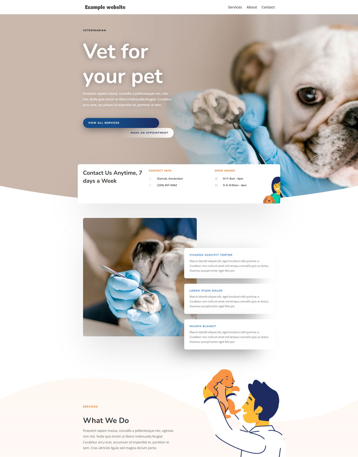
Veterinarian
Organise navigation throughout your website.
Effective website navigation is critical to a positive user experience. A simple navigation menu with clear labels that reflect the most important sections of the website can help visitors quickly and easily find the information they need.
To achieve this, it's essential to organize the menu logically and consistently. You might add a search bar and breadcrumb trails providing additional navigation options if the project would benefit.
Internal links can also help visitors explore related content.
Optimizing your website's navigation can encourage visitors to engage with your content and improve their overall experience on your site.
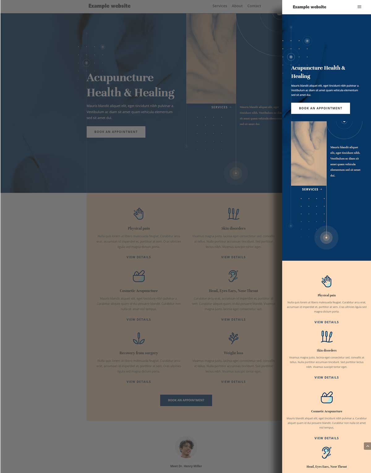
Acupuncture
A responsive web design is essential.
In today's digital landscape, a responsive web design is essential for success.
With the prevalence of mobile devices and varying screen sizes, a website that adapts to different devices and screen sizes is necessary to provide a positive user experience.
Responsive web design ensures that a website's layout, content, and functionality are optimized for all devices, from desktop computers to smartphones and tablets.
It also helps to improve search engine optimization (SEO), as search engines prioritize mobile-friendly websites in search results.
By investing in responsive web design, you can ensure that your website is accessible and easy to use for all visitors, regardless of the device they're using.
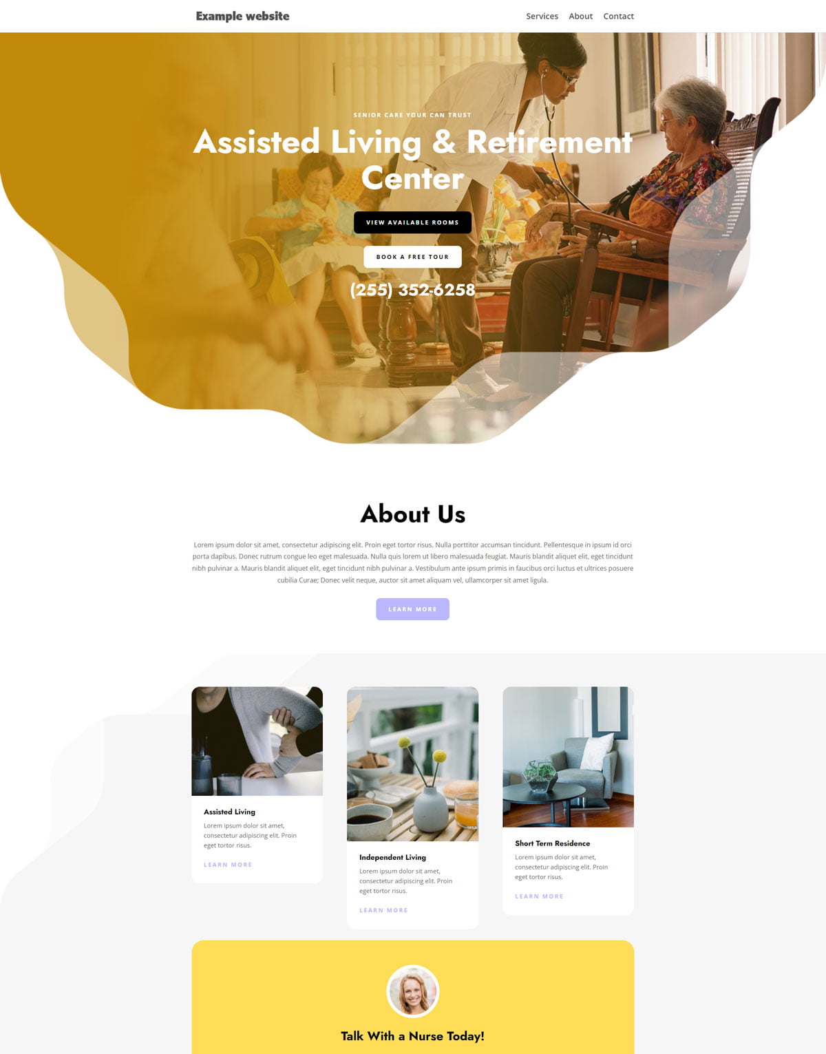
Nursing home
Keep in mind SEO.
When designing a website, it's important to keep in mind search engine optimization (SEO).
This means designing a website that's easy for search engines to crawl and index, which can improve its ranking in search results.
To optimize your website for SEO, you should ensure that your website's structure and content are well-organized, with descriptive and relevant page titles, headings, and meta descriptions.
It's also essential to use keywords strategically throughout your website's content and meta data.
However, it's crucial to avoid overuse of keywords, as this can result in penalties from search engines.
By paying attention to SEO in your website design, you can increase your visibility in search results and attract more traffic to your site.
Community website example
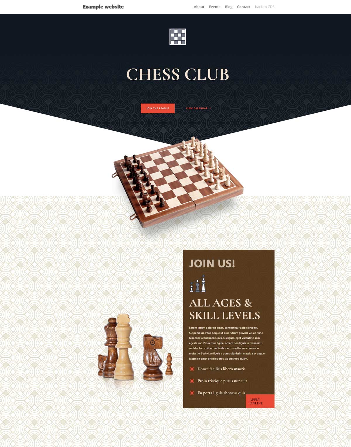
Chess Club
Create content for specified personas.
Creating content for specific personas is an effective way to engage your target audience and improve your website's user experience.
To create content that resonates with your personas, you need to understand their needs, goals, and pain points. This requires conducting thorough research on your target audience and creating detailed buyer personas that capture their demographics, interests, behaviors, and motivations.
Once you have a clear understanding of your personas, you can tailor your website's content to their specific needs and preferences. This might involve using language and messaging that speaks directly to them, providing content that addresses their pain points and challenges, and highlighting the benefits of your products or services that align with their goals.
By creating content that's personalized to your personas, you can increase engagement and conversion rates on your website, as well as build long-term relationships with your target audience.
Brand Identity
![]() Name development
Name development![]() Logo
Logo![]() Colors
Colors![]() Fonts
Fonts![]() Imagery/photographs
Imagery/photographs![]() Tone of voice
Tone of voice![]() Keywords
Keywords![]() Tagline
Tagline![]() Brand positioning
Brand positioning![]() Strategy
Strategy
Applied on
![]() Business cards
Business cards![]() Letterheads
Letterheads![]() Email signatures
Email signatures![]() Reports
Reports![]() Posters
Posters![]() Brochures
Brochures![]() Banners
Banners![]() Social media
Social media![]() Campaigns
Campaigns![]() Websites
Websites
Website design
![]() Website development
Website development![]() Hosting for websites
Hosting for websites![]() Custom emails
Custom emails![]() Enhanced security
Enhanced security![]() Back ups
Back ups![]() Technical support
Technical support
![]() Enhanced performance and UX (User Experience)
Enhanced performance and UX (User Experience)
![]() WPO (Web Performance Optimisation)
WPO (Web Performance Optimisation)
![]() SEO (Search Engine Optimisation)
SEO (Search Engine Optimisation)
![]() CDN (Content Delivery Network) improving WPO and SEO
CDN (Content Delivery Network) improving WPO and SEO
![]() Low carbon emissions websites
Low carbon emissions websites
![]() Landing pages (campaigns) design
Landing pages (campaigns) design
![]() Analytics
Analytics
![]() WordPress CMS (Content Management System)
WordPress CMS (Content Management System)
Communication Design Studio (Palguta) is a registered sole proprietorship in Norway number 926 834 789

